Once only the domain of creepy looking guys with bad ponytails and slacker young people, marijuana is becoming respectable. With this new legitimacy, marijuana has the opportunity to be something else all together: a wellness tool, a medical aid, a fine delicacy, an accessory to fun. With these new reasons to partake in various forms of the substance, and thus new people to market to, we are seeing a plethora of interesting design solutions for the branding of marijuana products.
At first, branding for marijuana was pretty much what you'd expect: literal. There were, and still are, a lot of leaf motifs involved. But now that the substance is legal in so many places, the market has opened right up. And so has the competition.
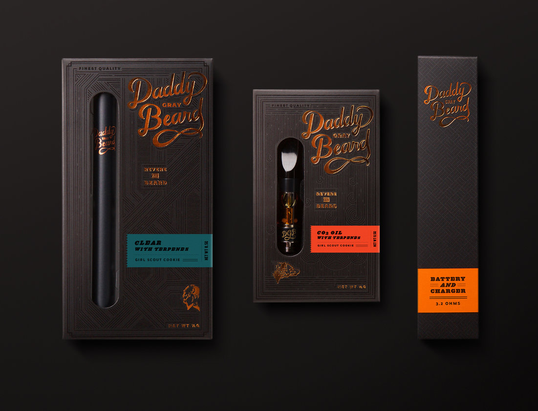
First up is Daddy Gray Beard, designed by Urban Influence out of Seattle. They've gone for the angle of Cannabis Connoisseur with this rich, old school visual identity that conjures images of leather, pipes, and bearded rich guys. Although the packaging is actually housing vape pens of apparently the finest cannabis oil, you could easily see them being used for a bottle of 18 year old Scotch.
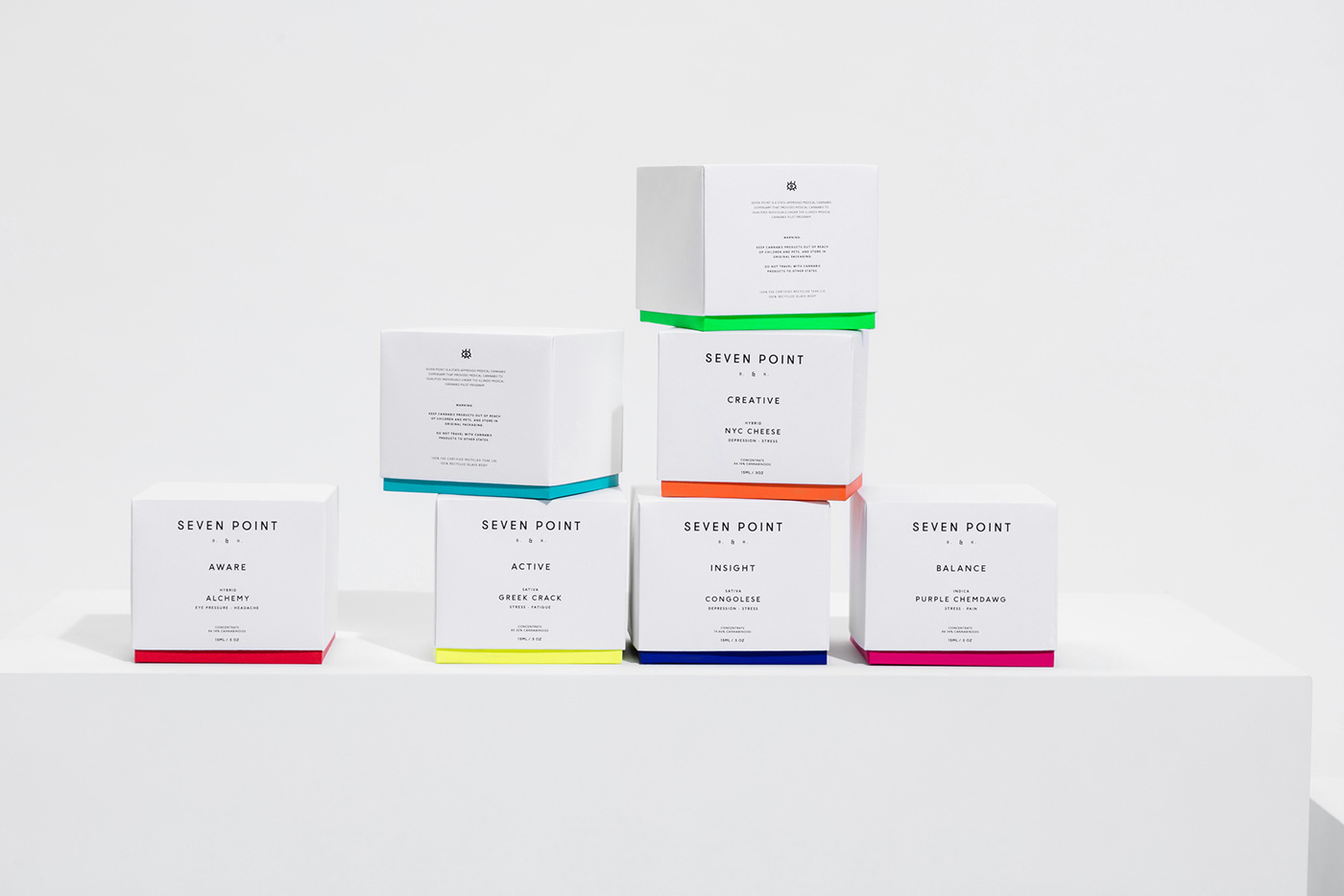
Compare that to the clean simplicity of Seven Point's packaging. Mexico agency, LaTortillería has crafted a brand that walks the tightrope between medicinal and "wellness". There are elements of the Seven Point designs that look quite pharmaceutical, specifically the strong use of white accompanied by minimal typography, and the style of their stoppered and droppered glass bottles. The packaging however, with its bright pops of colour, is more reminiscent of high end beauty products or perhaps vitamin supplements. Indeed, the name "Seven Point" is inspired by the seven chakras and the bright colours are groupings of the products based on the effect they have on the patient: Active, Balance, Calm, etc.
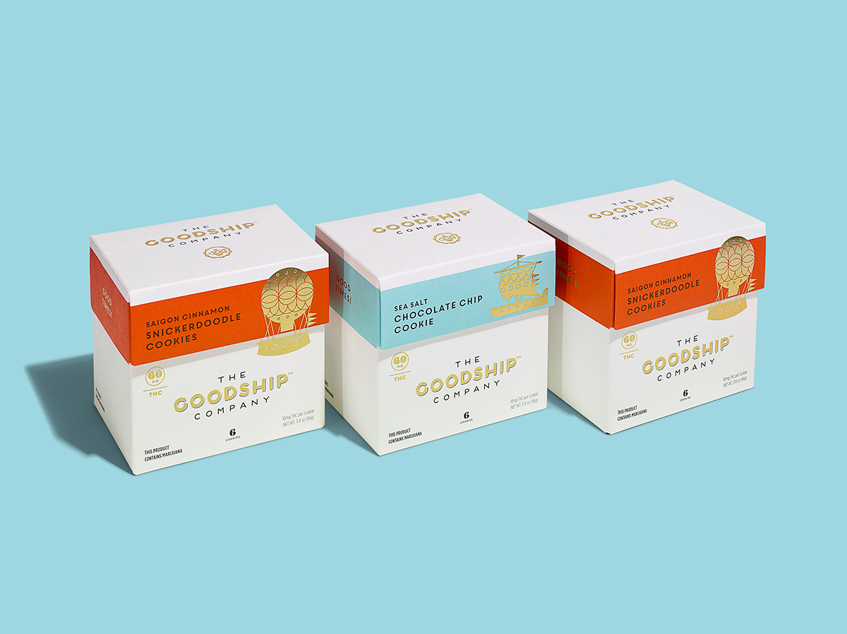
The Goodship Co. are purveyors of gourmet baked goods and chocolates infused with THC, so it is only common sense that Seattle agency, Mint has wrapped them up in a brand that is clearly identifiable as gourmet food. With their clean white space and gold foil, they communicate their position as a special treat. The addition of illustrations of different kinds of ships adds a lovely whimsical element that says "high end but fun".
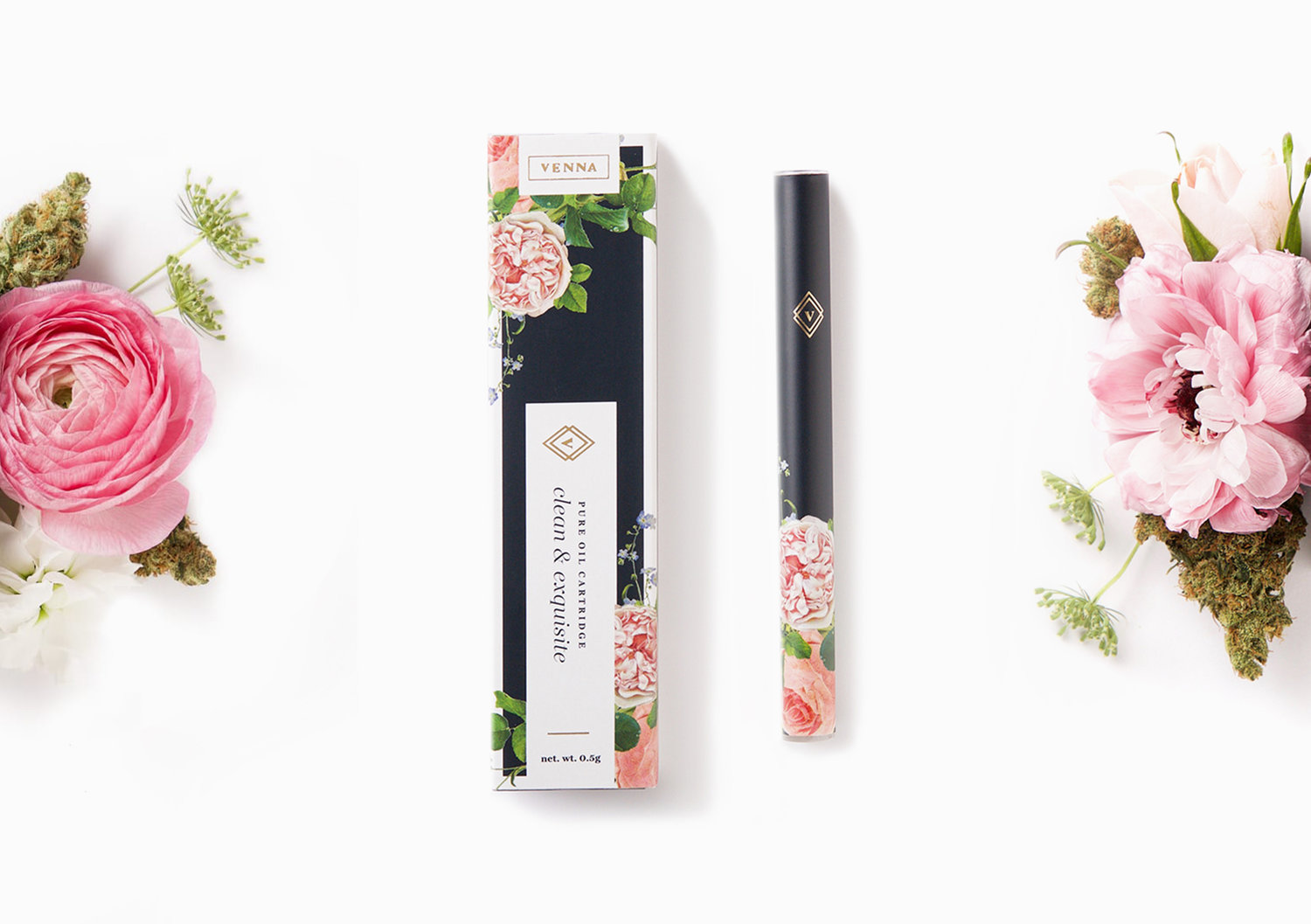
I love this next one – it's so pretty and definitely not what springs to mind when you think "marijuana". This floral confection was designed by Urban Influence (they might be developing a bit of a speciality in the industry?) and it is clearly very heavily targeted at women. Venna says that they "strive to forward innovation in an industry that's yet to speak to womankind." Alas, this is not the article to go into the politics of the clichés used in marketing products toward specific genders and the ridiculous extremes this can take companies to (Pink lady-pens, anyone?). It can be a fine line between insulting your target market and actually creating a product that they enjoy using. I find Venna's elegant, perfume-like atomisers and packaging a sophisticated take on this kind of product and interesting simply because it's the first time we've seen this done.
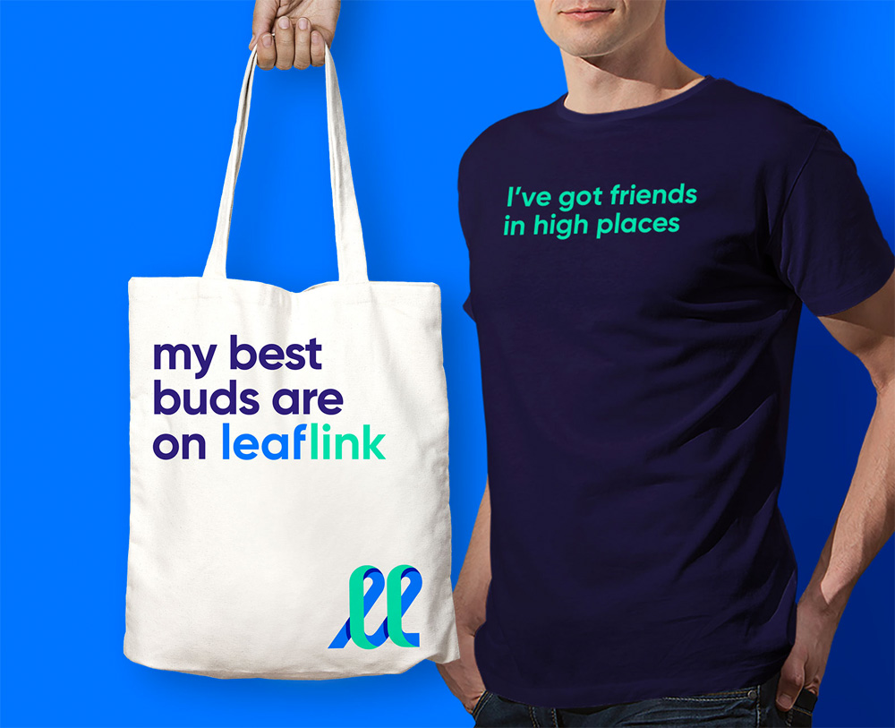
Leaflink's branding unquestionably places them in app/start-up land. Which is just as well, because they are an online marketplace connecting cannabis wholesalers, distributors, and retailers. Designed by Works Progress, the branding uses the kind of geo-sans typeface you'd expect to see used in a digital brand, with a dynamic palette of zippy blues and greens. Copy writing utilises a lot of marijuana-based puns which keeps the mood fun and energetic.
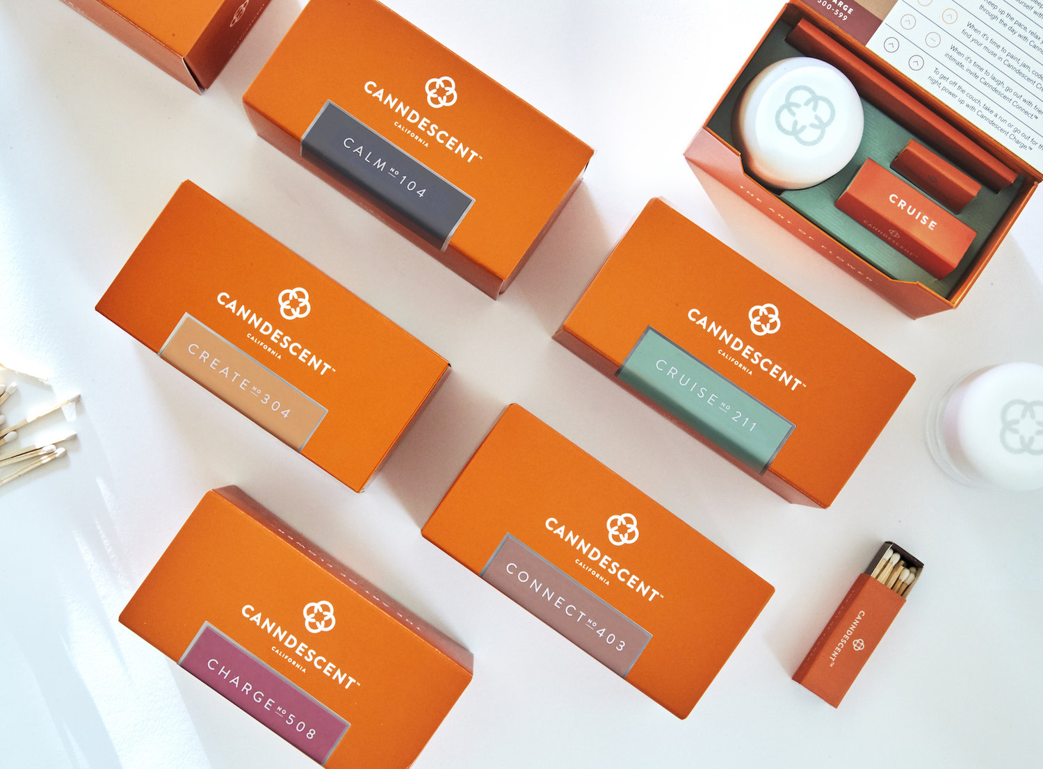
Canndescent designed their own branding in-house and describe it as it's as if "Hermes and Tiffany & Co. had a baby." I could easily see their packaging housing a high-end tea – the orange is a dynamic, yet sophisticated colour and the touches of silver foil lend just the right amount of luxury to the mix. Canndescent name their blends after the effect they give, and these labels of "Calm No 104" or "Create No 304" continue that connection to the wellness industry. The language they use in their tasting profiles are completely on point in this regard. For example, Calm No 102, "Produces serenity and an airy body feel, harmonic with yoga, stretching or lounging about."
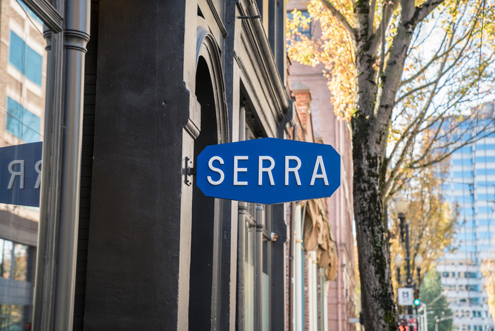
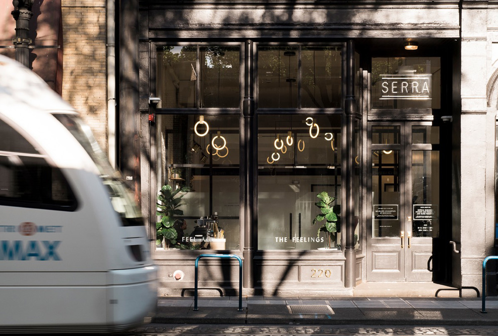
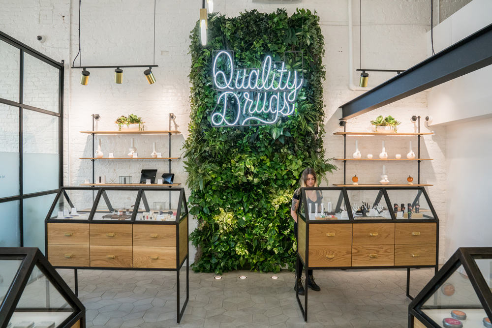
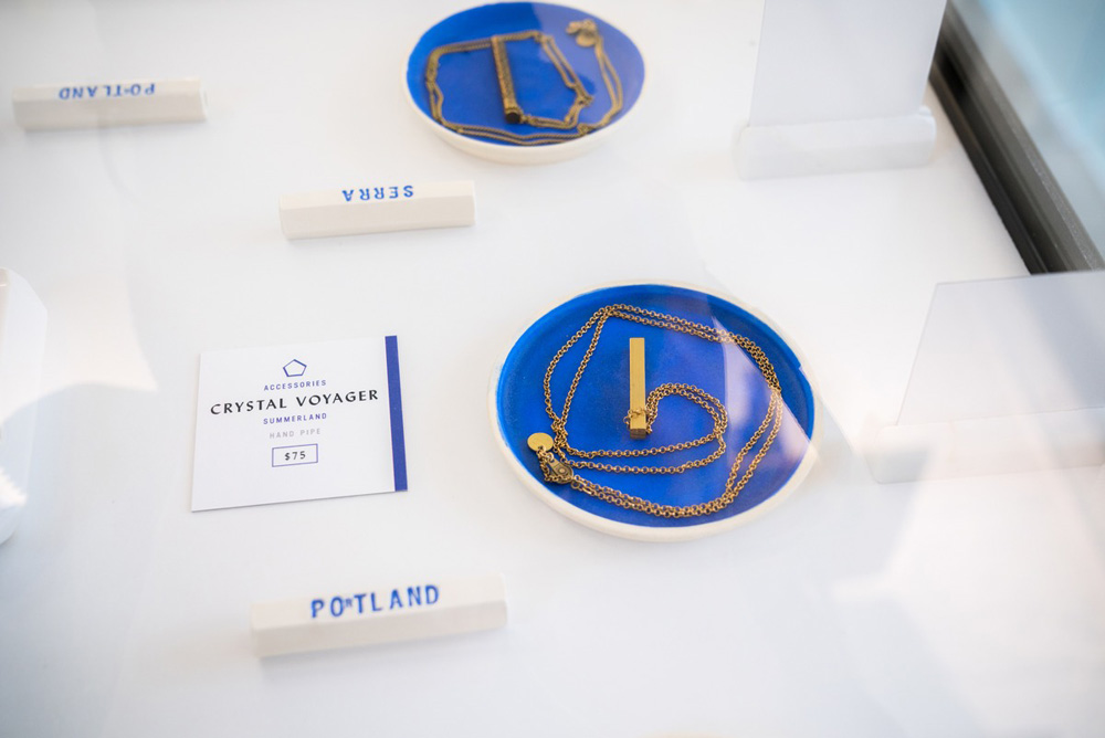
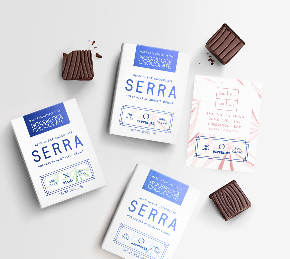
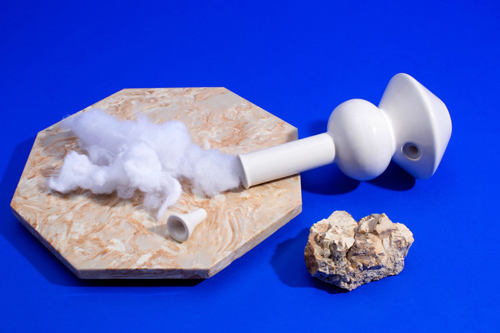
I've saved my personal favourite until last. Portland based OMFGCO designed the branding for Serra a high-end cannabis dispensary. They've created a beautiful in-store experience with the three Serra locations, the interiors being inspired by glasshouse construction, with a healthy dose of traditional apothecary thrown in. The visual identity is very clean and clinical, using white and a very bold reflex-type blue. The effect is elegant, but could come across as a little austere, perhaps stiff, if it weren't for the playful elements that are introduced when photography is used. I especially enjoy the cotton-wool smoke. From a pure graphic design perspective, I'm geeking out over the calligraphic sans serif that is used as a secondary typeface which somehow manages to connect to an idea of tradition and history while also looking thoroughly modern.
![]()
Phew! Who knew I had so much to say about weed? Since I couldn't possibly include images of all the aspects of the different brands in this article, I encourage you to explore the links I've included and gain a more complete picture of each of these brands. You may not be specifically interested in the marketing of marijuana products, but I hope you'll agree that it is a super interesting example of how there is more than one angle to a product and how essentially the same item can appeal to a wide range of audiences.
Image credits for main image collage:
Image credits: Highlighter, designed by Pavement / Alto, designed by LePro / Ganjabar, designed by RealHigh Leafs by Snoop, designed by Pentagram / Kiva, designed by MINE / THCheese / Batch Seven, designed by Stevaker Design / NuMist, designed by Dave N Roach / Royal Highness, designed by Cinj